Architectural Digest Ι June 13, 2019
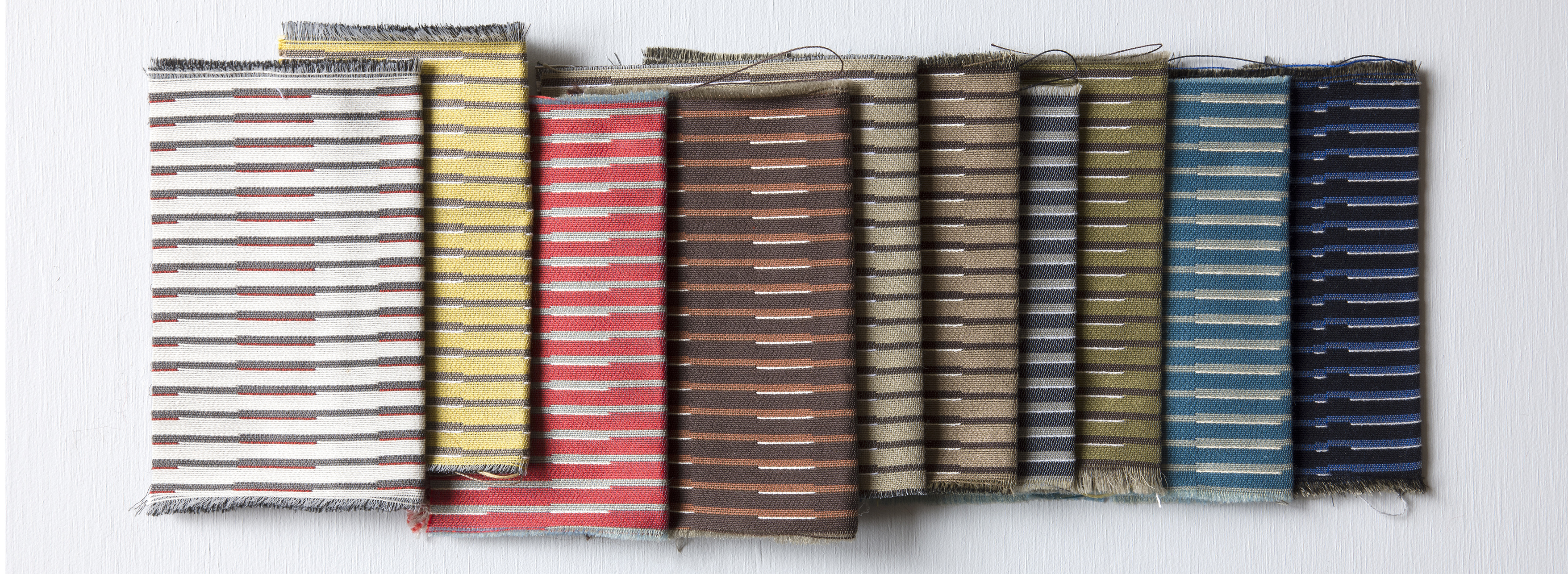
Aliki van der Kruijs developed her new line of furniture textiles for Wolf-Gordon, which just launched at NeoCon, through a series of totemic objects, each loaded with metaphoric meanings, textures, and patterns that recall her impressions of a faraway place.
During a porcelain residency in Arita, Japan, the Dutch designer was intrigued by a gridded kimono fabric that was “super simple, but also very detailed”—a double negative, where colors and patterns were reversed on either side, she explains. She applied the pattern to a porcelain vase with printed acetate, and the resulting overlaps and breaks in the grid caused by applying this infinite 2-D field onto a 3-D object created a delicate, feathery shading. Exploring a porcelain quarry, she collected discarded bits of porcelain, left behind in the wake of decades of thunderous strip-mine excavations that leveled a mountain. She wrapped them in the kimono grid as well, and began calling them her “Philosopher’s Stones.” Covered in a graceful fabric pattern, they’re an intimate, hand-held counterpoint to the spectacular violence of quarrying for resources. She still carries one with her. “I cannot just make an image,” says Krujis. “I create my worlds.”
From there, Kruijs flattened these patterns into textile sheets, and then applied them back onto more 3-D objects—furniture. The Veer upholstery line that resulted came from a series of alternating transitions between two and three-dimensions.
Kruijs took hundreds of photos in Arita, and the textures and colors she witnessed were a strong influence on the collection. One photograph in particular, of a rusting corrugated metal wall, delivers much of the collection’s color palette (blues, reds, browns, olives, neutrals, and some hopeful yellows) and texture all in one. Marybeth Shaw, chief creative officer at Wolf-Gordon, says she was drawn to Krujis because her work shows “great conceptual depth—I was attracted to her process.”
Veer considers the grid not an immutable plan or organizing ideal, but a fungible motif. “It’s good to have systems, but I really like to see how much I can stretch it, and make adjustments, to make new things,” says Kruijs. Aimed at hospitality and commercial applications, the collection has three primary variants. Float highlights linear sections of gridded boxes with differentiated colors. Slide largely eliminates yet subtly implies the grid’s y-axis, aligning variations of color in the x-axis. And Turn shifts rectangular grids off-axis, overlaid on top of a larger fabric, creating a shaded moiré pattern, one of Kruijs’s favorite moments of surprise in the collection. Throughout, Kruijs deploys the grid less as a static background or organizational method, and more as an illustrative technique.
Other designers have mined similar territory, and Kruijs was inspired by how Ettore Sottsass juxtaposed grids with irregular forms and geology. The patterns’ geometric layering also offers a strong Anni Albers and Bauhaus inflection. Introduced in Chicago for NeoCon, that’s an especially relevant allusion. This year is the 100th anniversary of the Bauhaus’s founding, and with the still-potent influence of ultimate Bauhaus director Mies van der Rohe in the city, Kruijs’s Veer is being launched amid its ancestral lineage. “It’s kind of a zeitgeist,” she says.
