July 2016 Ι Architect Magazine
Just five years old, Seattle-based Best Practice Architecture and Design has amassed a broad portfolio of residential, commercial, office, and restaurant projects. What distinguishes the firm is its ability to deliver an extra level of craft to clients by collaborating with photographers, metal sculptors, and neon artists on the city’s art scene. “We’re always looking for an excuse to work with our artists and fabricators … because it allows us to put more local, specific touches to our projects,” says Kailin Gregga, Assoc. AIA, who leads the studio with Ian Butcher, AIA.
Before founding Best Practice in 2011, Butcher worked for Roy McMakin, a Seattle artist whose practice had expanded into furniture and residential design. Butcher managed the residential projects, but wanted to strike out on his own with an emphasis on artistic craftsmanship. Gregga—who was earning her B.A. in architecture from the University of Washington while Butcher was pursuing his M.Arch. there—joined three years later after stints with Diller Scofidio + Renfro and LMN Architects. The firm name is “very open ended,” Gregga says, “and it allows us to morph the firm into whatever we need it to be.”
Indeed, Best Practice’s work lacks any consistent aesthetic beyond an appreciation for low-fi, natural materials and the use of modular, space-dividing elements. Its projects can be minimalist stage sets for retail customers, as in its design for the Seattle footwear boutique Likelihood, or they can be breezy Postmodern smirks, such as the optometry shop Eye Eye, also in Seattle, for which the firm hired sculptor Troy Pillow to build repeating metal gables within the retail area.
Best Practice often uses slat systems as art canvases, partitions, or, in the case of Seattle street food bistro Nue, to display the owner’s tchotchkes gathered from travel. In another local establishment, Estates Wine Room, two photographs (by Richard Knapp) of vineyards whose wines are featured on the menu are printed on opposite sides of another slat system. Visitors see one vineyard as they walk in one direction, and the other if they walk from the other end of the space.
The firm turned to slat systems when tech clients began asking for inexpensive, flexible, but decidedly non-cubicle space dividers for what might be their first bespoke spaces. With startup companies, “the enthusiasm is maximum,” Gregga says, but “the budgets are pretty slim.”
Butcher and Gregga see the space they’re given to work with as a metaphorical piece of toast to which they can apply butter, or butter and jam. “One option is to take the butter and spread it as thin as you can,” Gregga says. Another approach is to “put all of the butter and jam on one piece of the toast, and have this epic bite.”
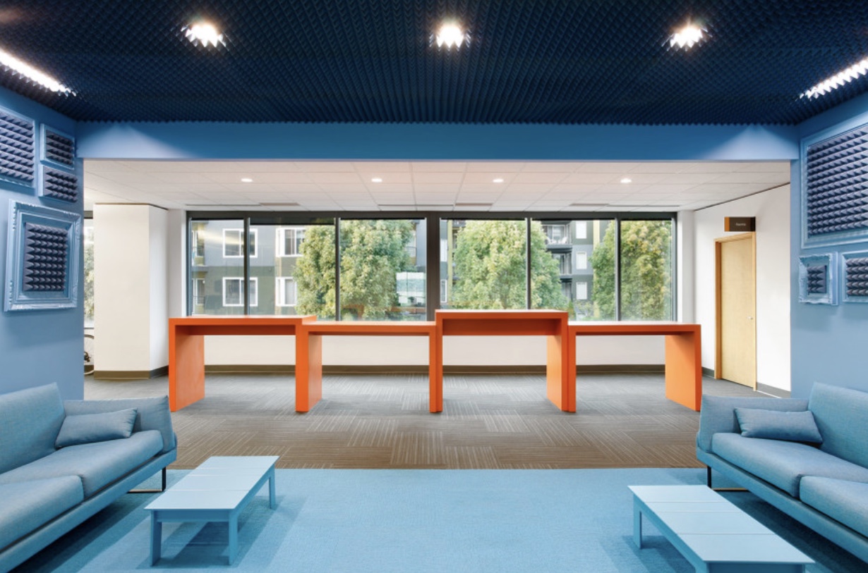
Their fit-out project for Simply Measured, a Seattle-based marketing analytics company, is an example of the first approach. Best Practice uses splashes of bright orange furniture and soft blue-painted walls, ceilings, and floors to create visual interest and quirk within the 20,000-square-foot office, as in its lounge area where a series of picture frames are painted to match the walls, with the art swapped out for foam pyramids. This lighthearted touch, along with alder tables, custom-designed by the firm, add warmth to the once monotonous space, while remaining within a budget of $35 per square foot.
The second approach, in which Best Practice seeks to create that “epic bite,” can be seen in an office renovation for a Seattle industrial design firm (which wishes to remain anonymous). Here, the designers put much of the budget into a plywood seating-and-shelving installation that creates a social space for visitors and employees while adding a moment of heightened liveliness to the generic floor plate.